Klaviyo rebrand,
site experience
and design system
UX Creative Director @ Klaviyo
Klaviyo is a leading customer data and marketing automation platform dedicated to accelerating revenue and customer connection for online businesses. In 2021, the company doubled its employee headcount, raised in $320M in Series D funding, and saw its platform leveraged by customers to generate over $28B in revenue.
Most recently, as a UX creative director at Klaviyo, I was asked to built a UX creative team in the creative department to support the growing marketing team. I led and worked with my team on the rebrand as well as the UX and the visual design of our site and its design system. With the goal to drive awareness, acquisition and improve our SEO in 6 months launch deadline.
Brand and content strategy, Information architecture, Testing and research, Rebrand, Brand design, UI/UX design, Art direction, Accessibility, Animation and Design system.
What we did
Klaviyo Rebrand
Own your data, Own your growth
In early 2021, Klaviyo went through a rebrand, we partnered and worked closely with an SF design agency on this effort. For the new brand, we focused on ownership as the core principle to Klaviyo's new brand identity. Klaviyo's new mark is led by a flag, which seeks to represent several qualities and principles that matter to us: data ownership, the communities Klaviyo helps its customers foster, the guidance the product gives, and success in speed. In addition, the color palette is rooted in neutrals with pops of bright color, and the imagery is warm and documentary-style, focusing on the confidence and strength of Klaviyo's customers.
As brand stewards, we continued to refine and iterate on our design system after our brand launch. While poppy(red) was most challenging color to incorporate into the style guid as it is a system color, we found innovative ways to incorporate poppy into our design while keeping accessibility in mind.


New site experience
and a design system.
I led and mentored the design team through strategic vision and conceptual work that established the new site experience for Klaviyo to shift from an email automation platform to an omni channel data driven marketing platform for SMB and Enterprise audiences. The design team worked as part of the larger creative team, consisting of UX and marketing writers, project managers, and brand designers along with marketing, product marketing, demand, SEO, research and engineering team.
The ask
In early 2021, Klaviyo received $320M in Series D funding. Klaviyo wanted to reposition itself as an SMB omnichannel marketing automation platform that helps brands deliver personalized experiences along their customer journey.
The ask was to design, build and launch an SMB site and its design system in 6 months to increase product awareness and market share, retain existing customers and target our new audiences.
User challenges and pain points
From our research, we learned that our SMB audience doesn't have much time to research while looking for a new marketing platform. They did not know to use first-party data to build better customer engagement and drive revenue on their online stores. Because of that, they only really cared about a few features, like easy-to-use email templates, easy integration with their existing platform, and automated segmentation.
Brand challenges and pain points
Through our research and interviews, we discovered that Klaviyo wasn't known as an omnichannel marketing platform. We were not a product that people had a relationship with; they had relationships with companies like Shopify and Magento, and we were only an email integration to their platform.
We learned from the SEO team that when people googled for Klaviyo, it isn't clear to them that Klaviyo offers more than email marketing; that is because 100s of pages were not optimized for SEO or our users, and we were not ranked very well.
The thinking
With our challenges, and pain points in mind, I led my team on the strategic vision and conceptual work that help established a customer centric journey for the future Klaviyo site experience with our stakeholders. We identified themes for how we can think about the future SMB experience. We asked ourselves how might we…
Increase SEO and page authority to outrank the competition in search engine results and gain market share organically?
Create an experience for our SMB audience that change their perception of Klaviyo as an email marketing platform to an omni channel marketing automation platform and educates users on first person data marketing to bring value to our platform?
Build a content-friendly design system that allows us to quickly scale up and launches new product launches and features while decreasing the dependency on engineering on future project?
Reduce cognitive load by creating a scannable and digestible reading experience on complex product flows?
The result
By the end of this six months project, I had successfully led my team to establish Klaviyo's new brand and the SMB and Enterprise experience. We designed in detail how consumers would interact with Klaviyo across multiple products and features to their customer engagement as the result we increased our SEO and product awareness. We reimagined our pricing page to increase conversion and market share.
The new experience increased visits to the pricing page from the homepage and core pages by 35% and improved overall site engagement, domain authority, and page views. I was proud to see my new team rise to the challenge. The skillset used and learned in this project was helpful to their overall growth and upcoming projects.
User-focused experience
We learned that our SMB audience doesn't really want to use all our features; they only really cared about a few, like our easy-to-use email templates, easy integration with their existing platform.
The biggest insight was that they don't have much time to research while looking for a new marketing platform. I worked the team to create a simple and focused navigation experience that provides users with the information they need at their fingertips with minimum effort.
A task focused, SEO-driven navigation
The nav was designed to answer users main concerns and questions when visiting our site for the first time
Products - What do you do?
Resources - Why should I trust you?
Pricing - How much does it cost?
Considering different users needs at different points in their journeys, we included both sign-up and get a demo CTAs to increase user engagement.
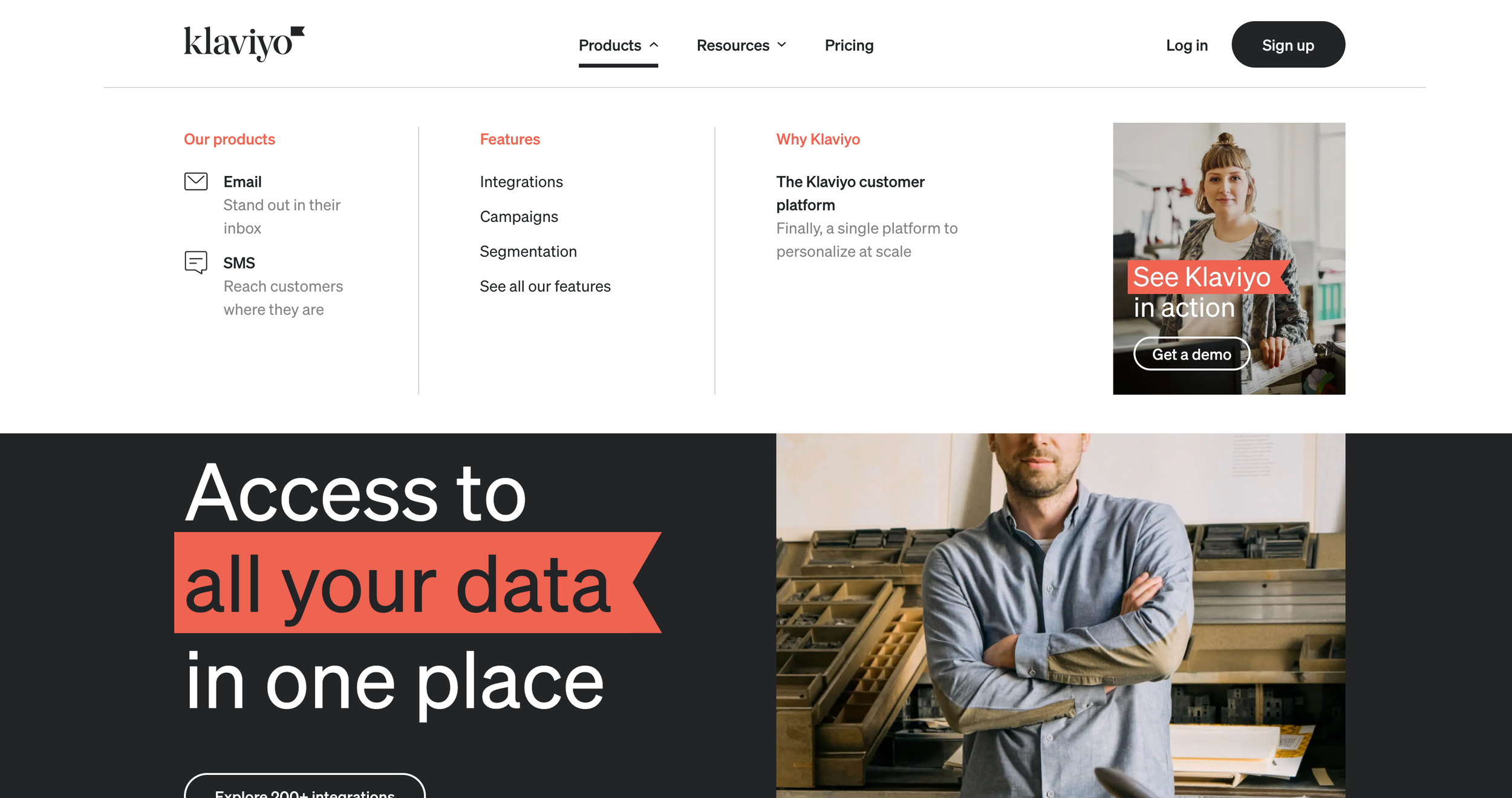
Main Nav-Products
We designed our product section as a one-stop destination for all the information our users will need/want to make an informed decision to switch over. The section was organized by three things that our users cared most.
Our products is simple and direct. It highlights Email and SMS. Our two core products that users are looking for.
Features was organized based on the three top marketing platform features searched on google when our users are looking for a new marketing platform. We did a card sorting exercise to determine the hierarchy.
Why Klaviyo was created to highlight and educate our users our data-driven automation platform as a key product differential.
Working with our research and SEO team, we conducted unmoderated card sorting exercise to determine our hierarchy.
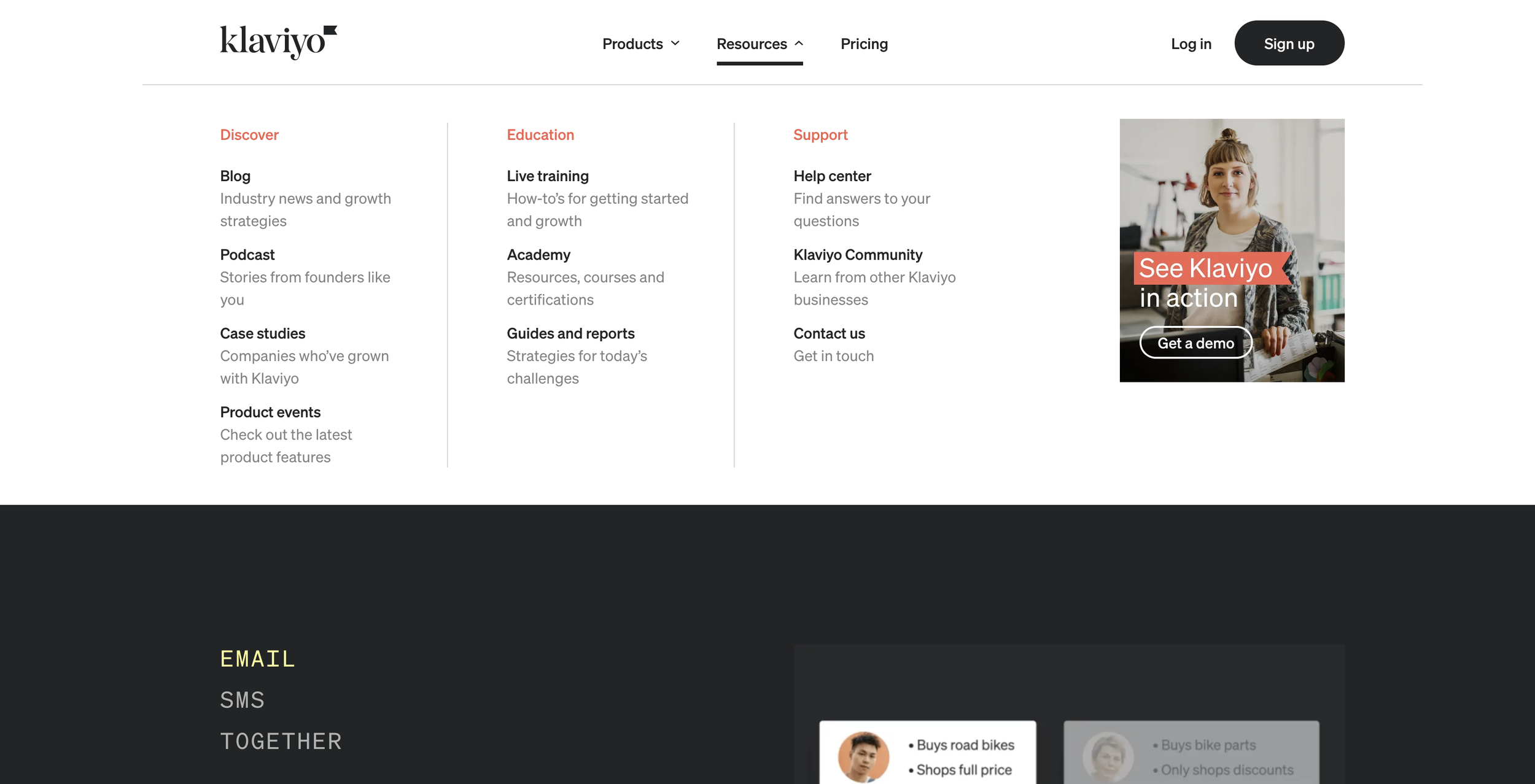
Main Nav-Resources
SEO driven, we designed and organized the resource section to empower our prospects and customers by educating them on best practices and insights on using first-party data to drive customer-first strategies and gain their trust.
Discover is library of premium content of blogs, podcast and product events created by our content team.
Education is a collection of branded contents created by Klaviyo education team to educate our users on first person data marketing and best practices.
Support as a resource section for users to find questions and get help from their peers.
Main Nav-Pricing
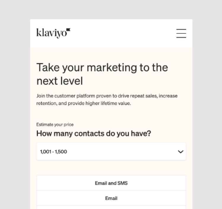
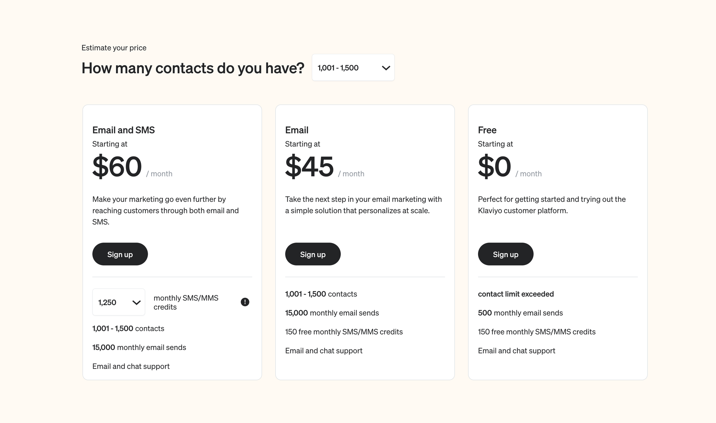
Pricing page is where all our effort in building a relationship with our customer finally leads to a sale. The intent for our pricing page was to help answer the final question, "Is Klaviyo right for me, and how much is it?"
From our research, we learned that 50% of our current users engage with us through our mobile site, but the mobile conversion rate was less than 10%, and our current pricing page experience was confusing to our users as we had separate pricing pages for different packages.
The team and I ideated and designed a clean and mobile first experience to increase conversion and trust by providing users with the details of each plan and its benefits in a single glance. Despite losing five weeks on the project due to business alignment, the team conducted some user interviews with our wireframes to increase clarity for the users on our pricing structure and their needs.
Conducted user interviews with the research team to understand better what SMB users care most about on a pricing page other than the price point.
Card sorting exercises with the research and PMM team to understand better which core features are essential for users when making their decisions.
Designed a scannable and digestible mobile first pricing experience guided by competitive design research and design exploration with the team.
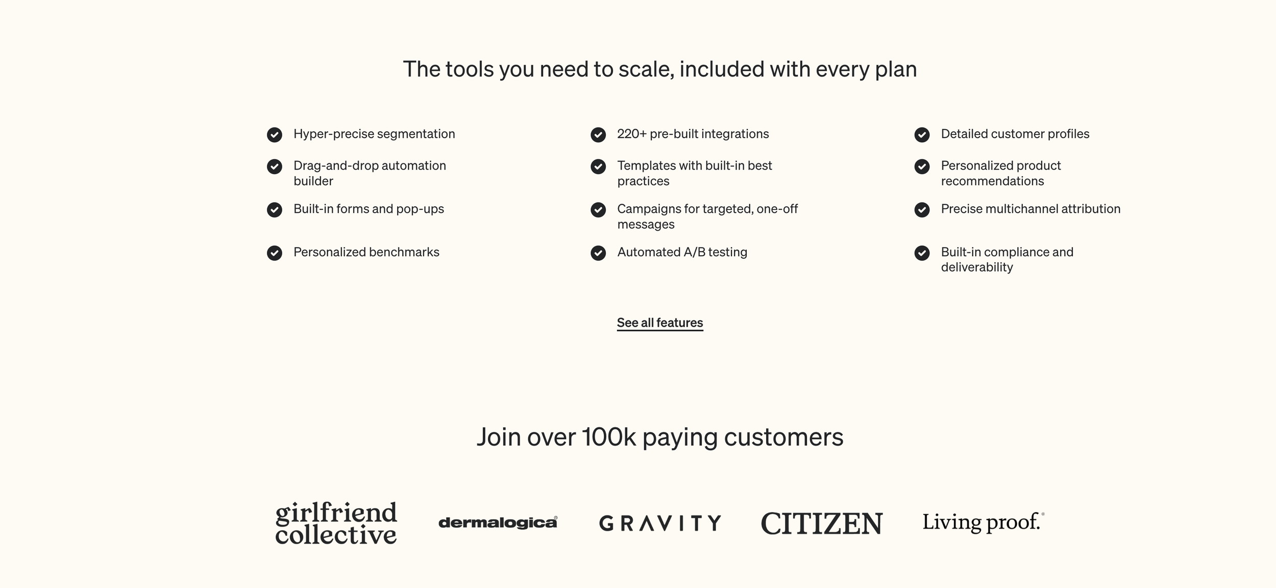
A check list of all the features that users care about based on google search and our interviews to increase confidence in Klaviyo products.
FAQ section was designed with the top 10 questions from our user interviews. We ordered them by the most asked question to the least to establishes trust and overcome obstacles to conversions.
Product Illustrations
Simplifying complex product stories
Show, don’t tell. As part of the goal to change our customers perception of Klaviyo as an omni channel marketing automation platform that delivers personalized experience along their customer journey. My team and I worked closely with stakeholders to design library of easy to understand and scalable animated product illustrations that highlights and educate our users on benefits of our deep and something complex product features and functionality.


A smart and scalable design system
Designed for flexibility and speed to market
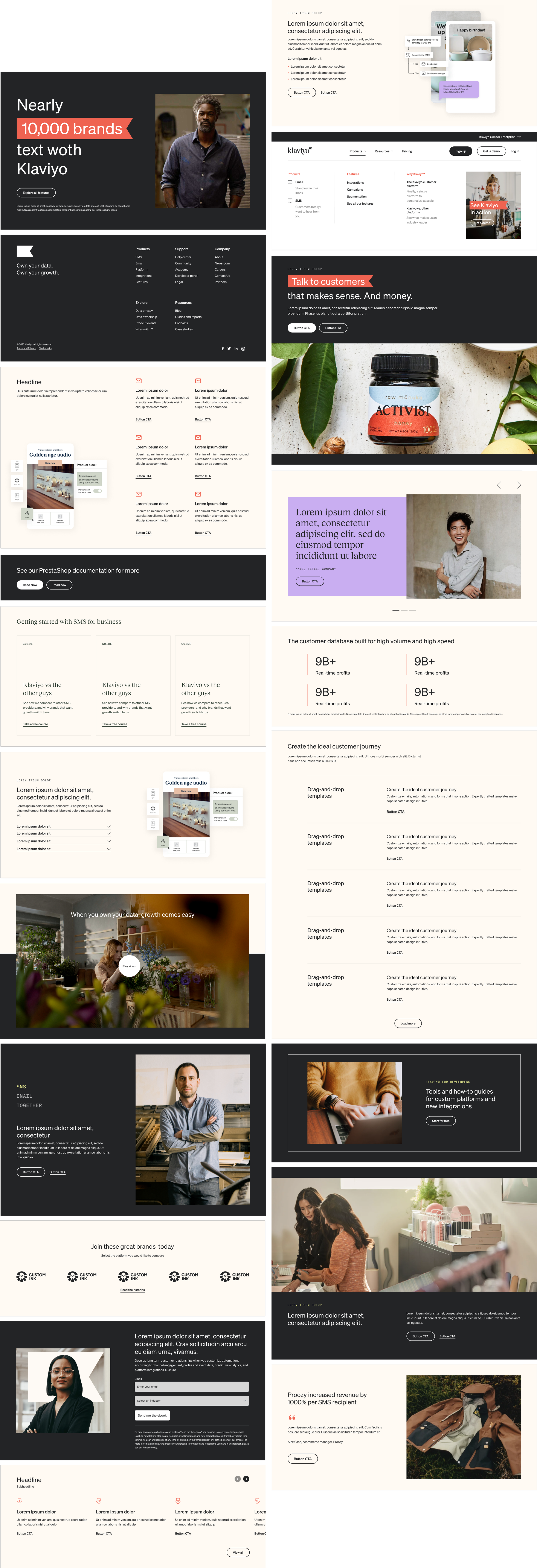
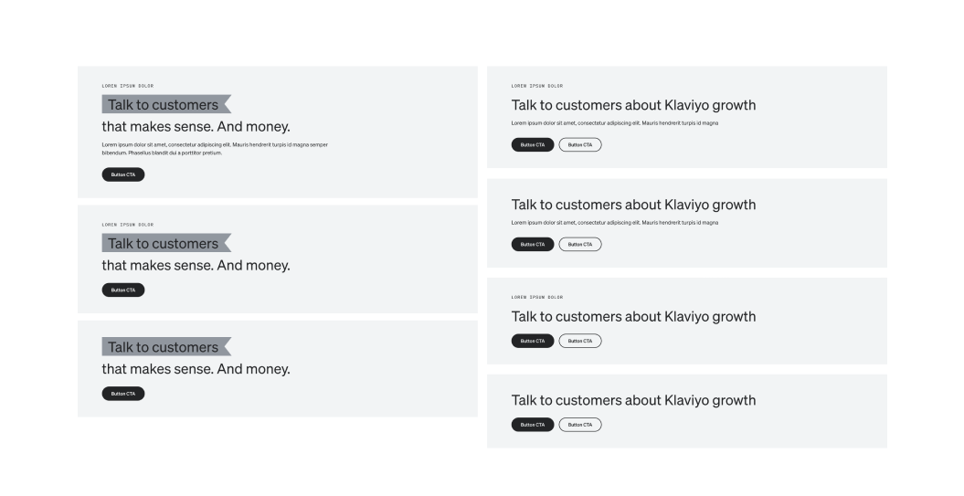
To decrease the dependency on engineering on future projects and product launches for the marketing team. We designed 16 pixel perfect atomic modules by end of the project. Each module was carefully designed by use cases with the ability to scale and flex for different content needs. Using properties and variants in Figma, we designed these modules to empower the content creators with the ability change the font size and colors as well as add or hide, eyebrow, body copy, subhead, CTAs, images and other elements.
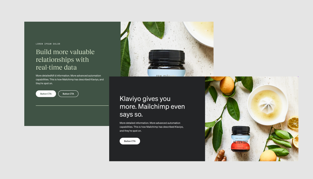
Example - Hero module
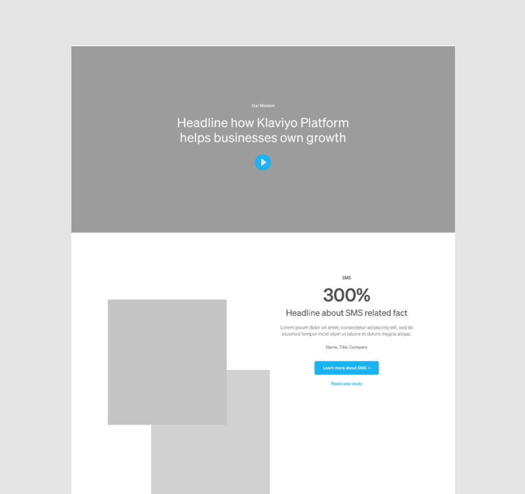
As an example, Our Hero module has three different variations. We determined its use case and needs through our wire-framing workshops on the core pages with our stakeholders. Features including having one or two CTA and hiding elements like subhead and eyebrows.


The final component library
Meaningful use of colors
We mindfully introduced our bright secondary as as a focus element for our users and and as design element in our interactive experiences to bring and surprise and delight.


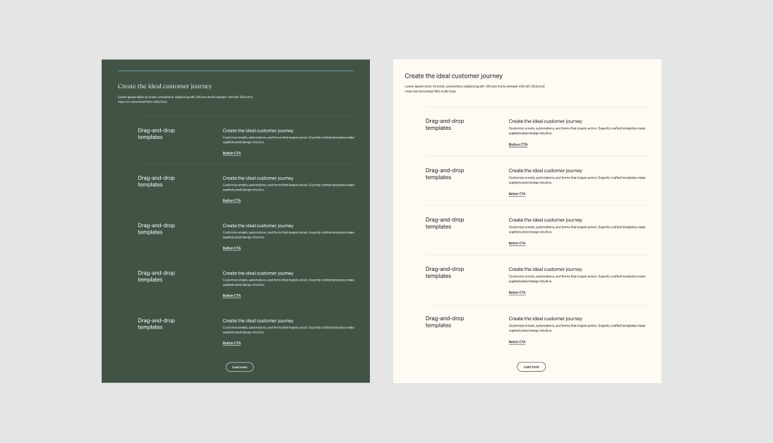
Dark and light mode
We also designed Dark and Light mode for all the designs. We had an idea giving the user an option to view the site in dark or light mode or make the site dark after sunset based on users CPU clock to increase usability.


Putting it together
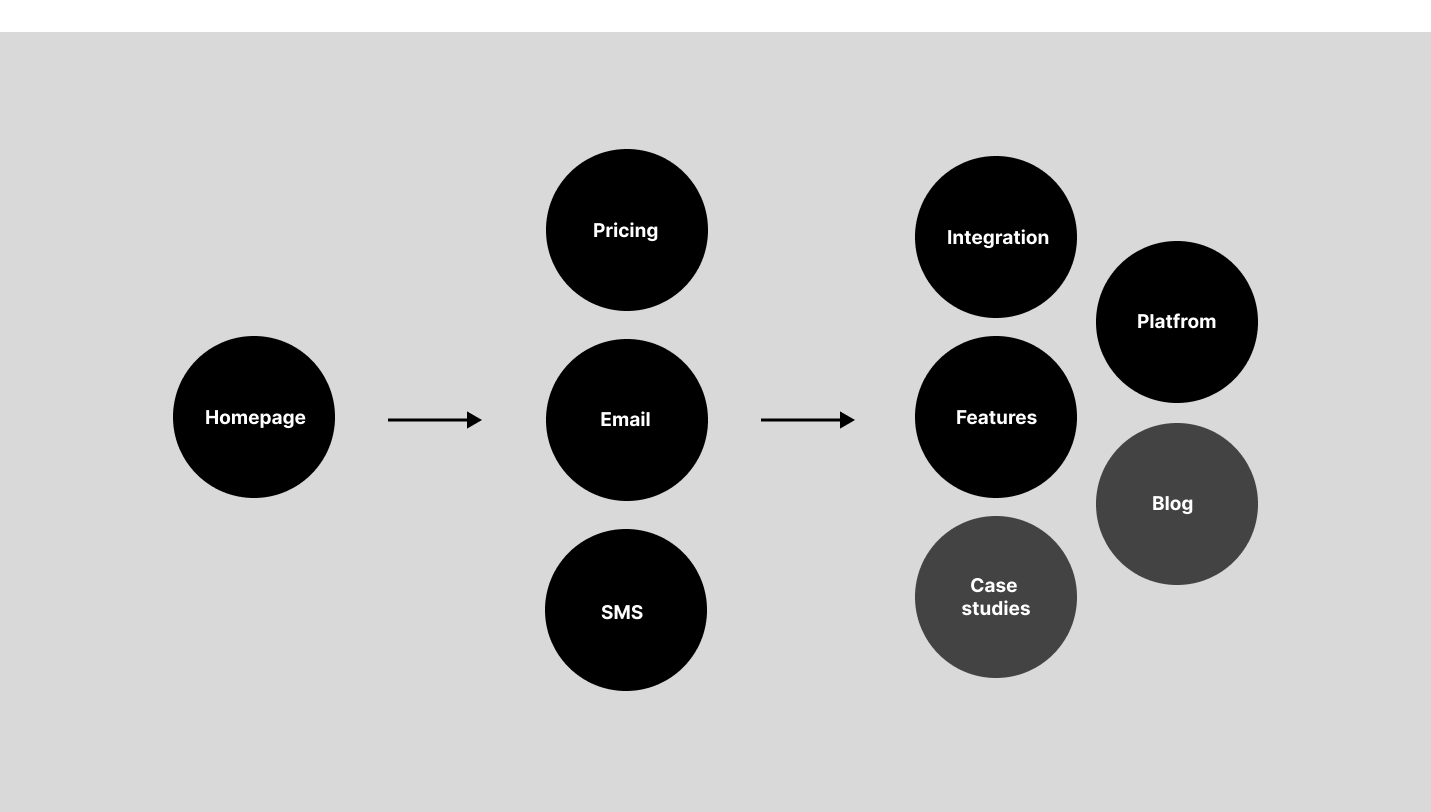
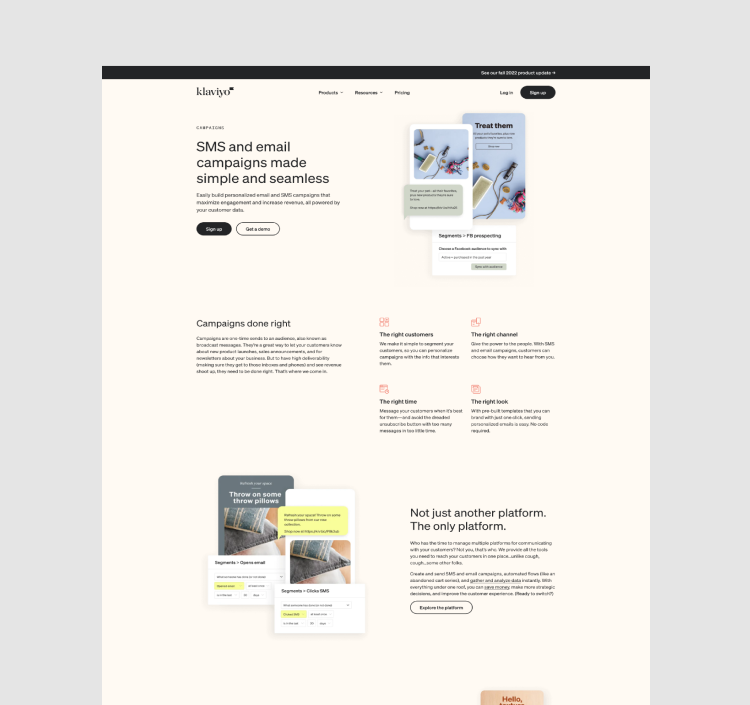
The team and I worked closely with our stakeholders to wireframe and design the site experience, including the homepage, product, integration, case studies, features, and blog pages to create customer centric experience.
Collaborated with the PMM, SEO, demand, and the growth team to wireframe and design an SEO and user-driven experience.
Ran daily design stand-ups and sprints with project managers and the design team to ensure projects were delivered on time and to empower the team by fostering ownership and trust.
Worked closely with the engineering team on design challenges throughout the design exploration, and sprint hand-offs.


One design system, two different sites for two different GMVs
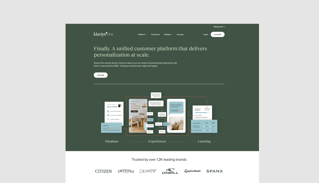
Two months after the main site launch, we launched Klaviyo one, as a MVP experience for our Enterprise brand. During our discovery sessions, we learned that our Enterprise audience were looking for unified omni channel marketing platform that empowers them to gain data insights and reporting to optimize their multi-channel campaigns and scale with their business. While our Our SMB audience doesn't really want to use all our features.
I led the team through strategic vision and conceptual work that established the new Klaviyo one experience. Working closely with our stakeholders, we created an Enterprise experience that focused on the benefits of our data platform as our key differentiator based on our research. Leveraging our flexible design system and modules, we designed a unique elevated brand and style guide, including new fonts and color palettes, to increase speed to market and reduce tech debt.

