Flexport website refresh
and design system
Design Director @ Flexport
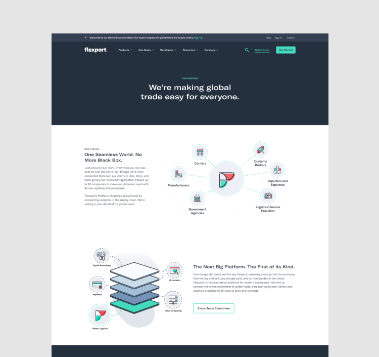
On a mission to make global trade easy for everyone, Flexport is building the platform for global logistics—empowering buyers, sellers, and their logistics partners by building transparency across the trade lanes. Companies use Flexport products and services yearly to move more than $10B of merchandise across 112 countries.
During my three-year tenure at Flexport, I had the pleasure of leading and working alongside a team of incredibly dedicated designers with PMM, SEO, demand, lifecycle and Engineers on optimizing and maintaining our website and design system to increase conversion and web authority through user-centric processes.
What we did
Content strategy, Information architecture, Testing and research, UI/UX design, Art direction, Accessibility, Animation and Design system.
The ask
In early 2020, preparing for IPO, we were asked to refresh our website and reposition Flexport as a data-centric global logistics platform for Enterprise business. We needed a site to drive awareness, acquisition, retention and upsell to our new audience. We also needed to replace our page templates-based CMS that was slow and rigid with an atomic design system to increase speed to market and design consistency while operating under a tight deadline.
Brand challenges and pain points
Our research taught us that while Flexport enjoyed a strong brand presence in the SMB space, we were virtually unknown in the Enterprise world. So, logically, we needed to create a site experience that was more empathetic to our Enterprise buyers, sellers, and shippers pain-points to increase product awareness and gain their trust.
User challenges and pain points
We also learned that the lack of transparency between buyers, sellers, and shippers was their most significant business challenge, a hugely common problem in the uncertain world of global trade, and this is why Flexport was built! Without transparency, companies could not operate at the maximum level.
The thinking
Given our knowledge of the brand challenge and consumer pain points, the team and I began to closely work with PMM, SEO, growth, demand, and research team to determine our users and the business needs and goals and identified the themes and principles for how we think about our future experience. We asked ourselves if people visited our site, how might we…
Create a customer-centric Enterprise experience for buyers, sellers, and shippers to increase conversion?
Build trust and authority through our thought leadership and content?
Leverage our platform as the data-driven end-to-end solution that brings transparency to global logistics?
The result
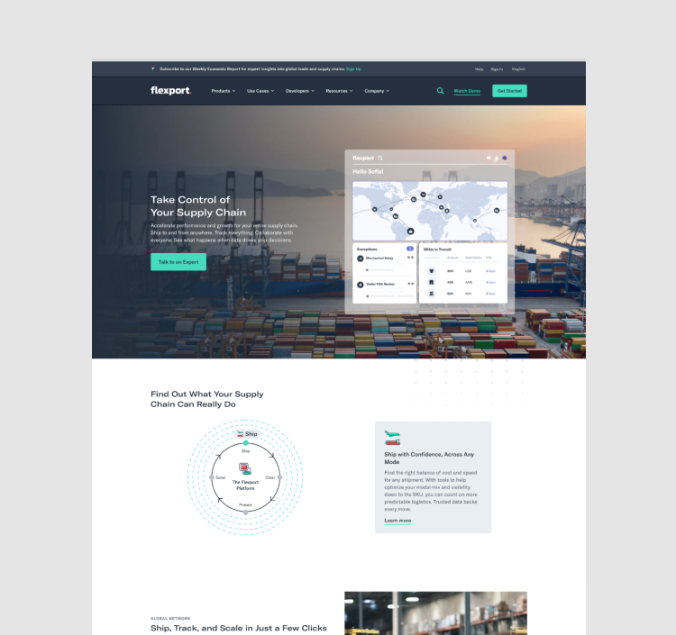
By the end of this three months project, I had successfully led my team to design Flexport’s Enterprise site experience and its updated design system. We designed in detail how consumers would interact with Flexport across its end-to-end products and features, increase SEO and product awareness and reimagined our sign-up page to increase conversion and market share. The redesign increased sign-up completion by 57%, visits to the homepage by 250%, and improved overall site engagement, domain authority, and page views.
Multiple personas centric navigation
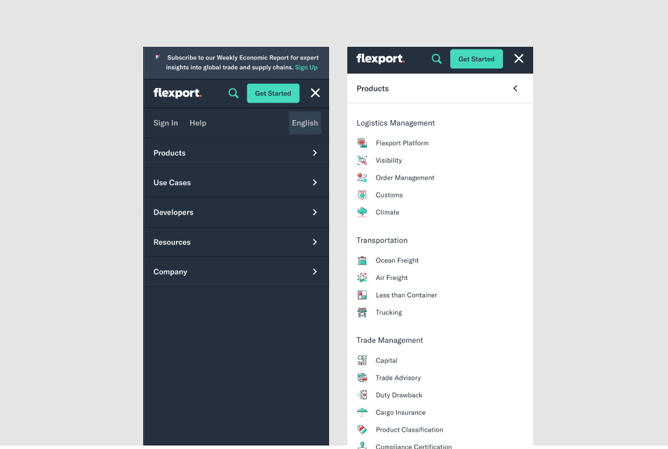
Working closely with the research and SEO team, we conducted some closed card sorting exercises to help inform and organize our site and nav structure. We wanted to create a user journey that was empathic to our buyers, sellers and shippers needs. With that in mind, we designed an audience based navigation that will help shape the rest of the site experience.
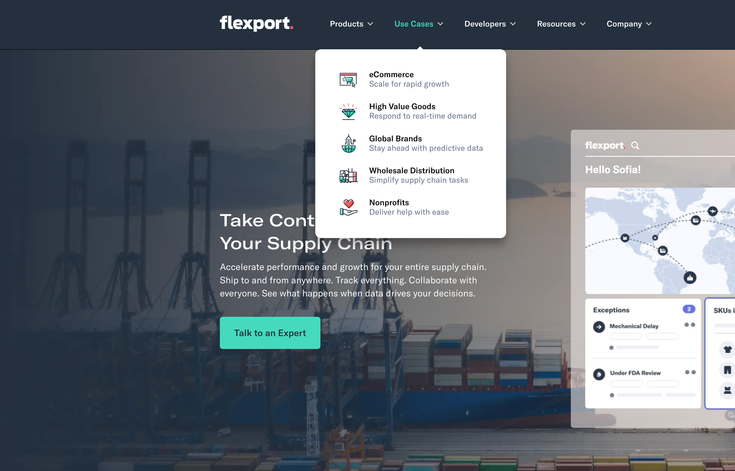
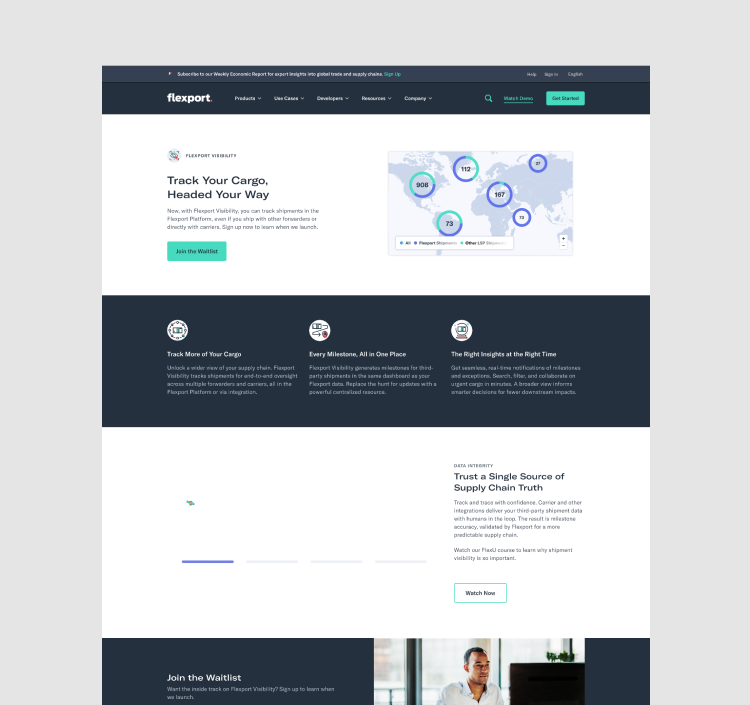
The products section was organized into three main categories based on our three different personas. The product section provides our users visibility to our end-to-end product offerings in a single glance as a solution to bring transparency to global logistics while addressing their individual pain points in the product detail pages.
Buyers = Logistics management
Shippers = Transportation
Sellers = Trade management
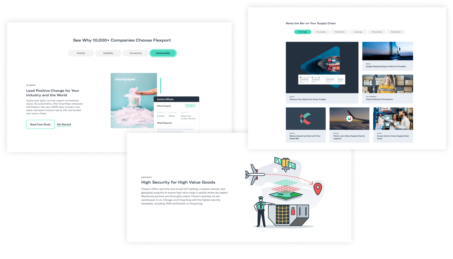
The use cases section was organized and design to served as a collection of landing pages to drive awareness and acquisition by highlighting our core platform benefits through the lens of our four core vertical pain-points and needs.
eCommerce,
High value goods,
Global brand,
Wholesales and Nonprofit
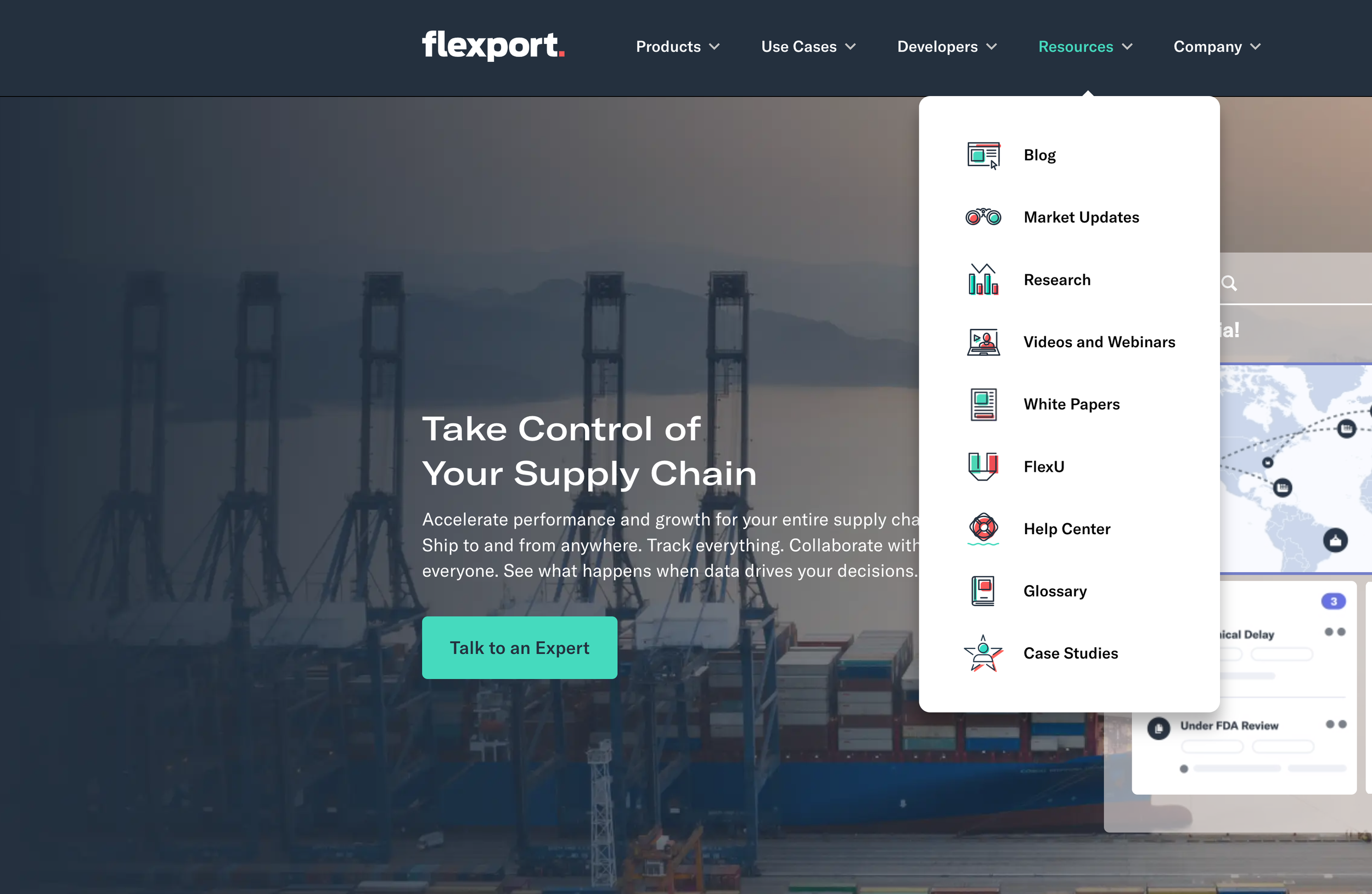
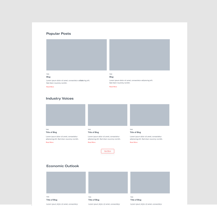
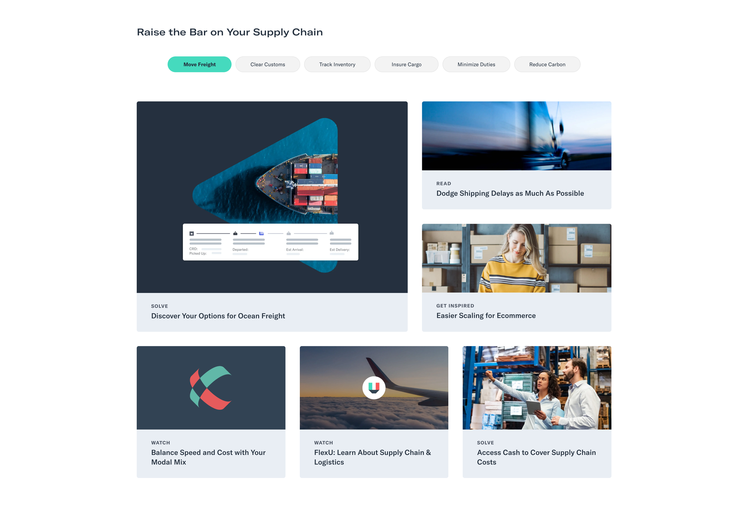
The resources section served a content hub, a collection of thought leadership and industry insights, and other contents including our university (Flex U), market updates, research, and webinars to empower our users to be better informed about the uncertain world of global trade and to gain trust as industry expert.
Building the journey
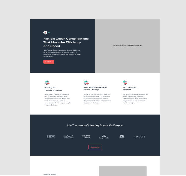
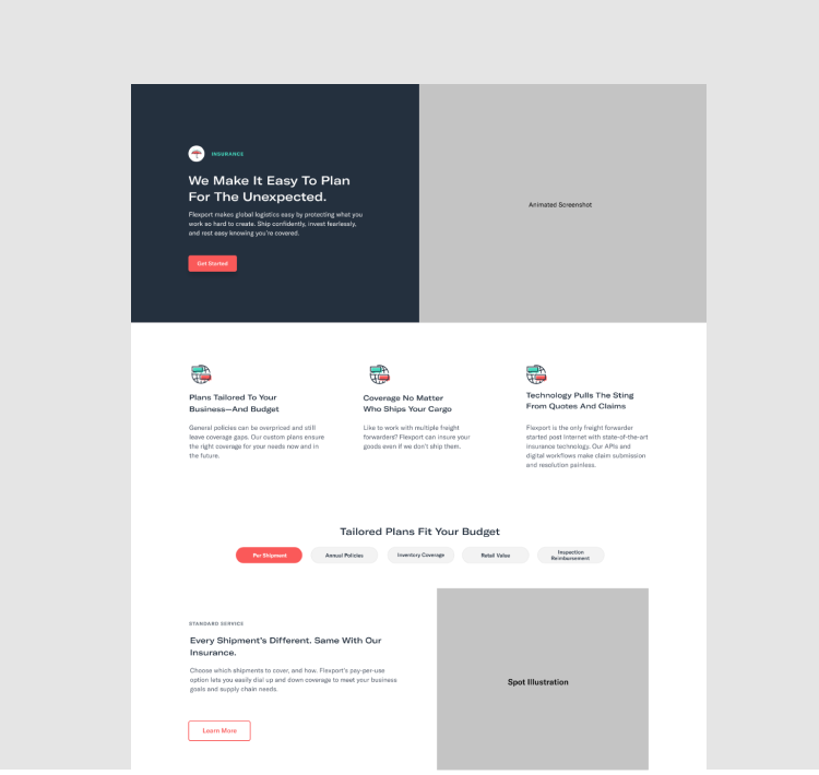
Armed with our defined user flow and navigation structure, the team and I worked closely with PMM, SEO, and the demand team to wireframe and design over 20 pages, including the homepage, product page, use cases pages and our resource center to define our user journey and to help determine our new component library.
Worked closely with PMM, SEO, growth, demand, and research team to determine our users and the business needs and goals, key messagings including product benefits for each of our personas and end-to-end user journeys for core navigational pages.
Partnered with the PMM, demand, and SEO team on content audit and inventory to evaluate the current experience's quality and to uncover new opportunities and gaps to increase conversion and discovery.
Worked closely with project managers and stakeholders to determine which pages got a complete redesign or migrated to the new CMS based on page views, conversion rate, and business importance.
Worked with internal stakeholders, leadership and team to promote transparency, buy-ins and alignment among the cross functional team in a fast and ambiguous environment.
End to end product story in single experience
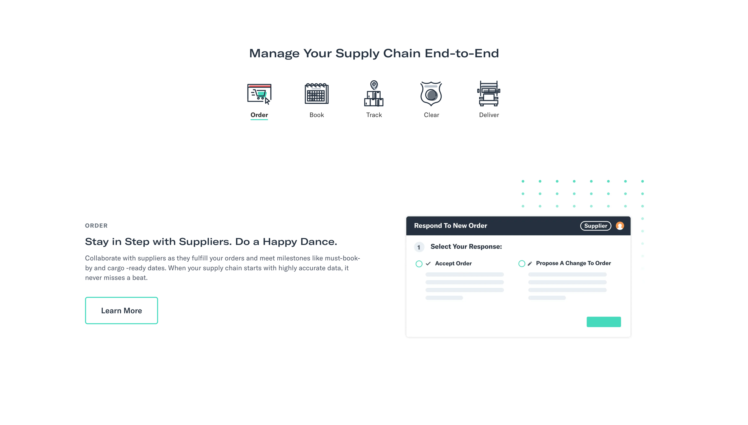
Knowing that it's often overwhelming and confusing for our customers to understand how Flexport can be a data-driven end-to-end solution that brings transparency to global logistics. We worked closely with the PMM and SEO team to concept several experiences that tell that complex story in an easy-to-understand and delightful way. These module helps users understand the benefits of our platforms and educate them to be better leaders and managers.
Simple updated sign up flow to drive nurture and conversion
Working closely with the demand, life cycle and sales team, the team and I did quick experimentation on our sign-up flow to decrease the drop-off rate and increase our sign-up completion. One of the core challenges with our current sign-up flow is that we need detailed information for our sales team that is not readily available to our users; having a single sign-up experience, the drop-off rate was high.
The hypothesis was that we divided our single sign-up form into two parts, with the second part with the more complex questions. Then, we could capture their email address to funnel them through our email nurture flows to educate our prospects with our thought leadership and webinars to gain trust in our expertise and services.
As a result of this quick experimentation, we improved sign-up completion by 57% and dramatically increased the number of prospects in nurture flow.
Module audit for migration
As part of our discovery, we collected all the pages to do a modules inventory, we organized the modules by its use cases to identify the what was needed for migration as well as discovered inconsistencies and redundancies in the design for a design update; we reduced the number of final modules to 16 from 35.
Module Audit
Page Audit
Updated style guide and new design system
Informed by our design audit and designs, the team and I identified and designed 16 responsive modules as part of our new design system. Collectively, we decided to keep the current brand guidelines as we rebranded a year ago; however, we updated the style guide for accessibility and usabilit
Led the design team on defining the look and feel of the website and our updated style guide.
Led and worked with team to design our updated design system and components library from drop-downs, a tab system, forms, buttons, icons, photograph, video player, product illustration and more.
Carefully defined and designed 16 modules based on content needs and its use-cases with the UX writers and designers.
Conducted UI accessibility tests on the new design system to increase SEO and usability.
Worked closely with the design and engineering team on functional documentation and updated style guide.
Led the team on the Design QA
As a result, we achieved greater consistency with our UI design and scalability with our modules and speed to market on our website experience.


